Drop
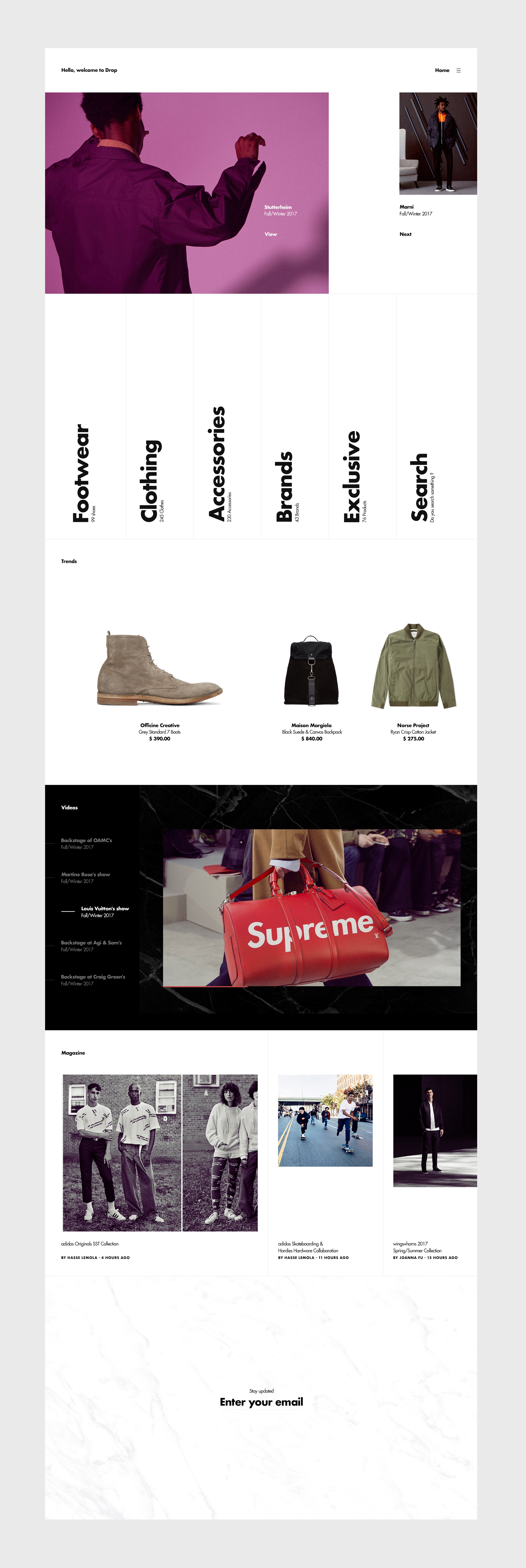
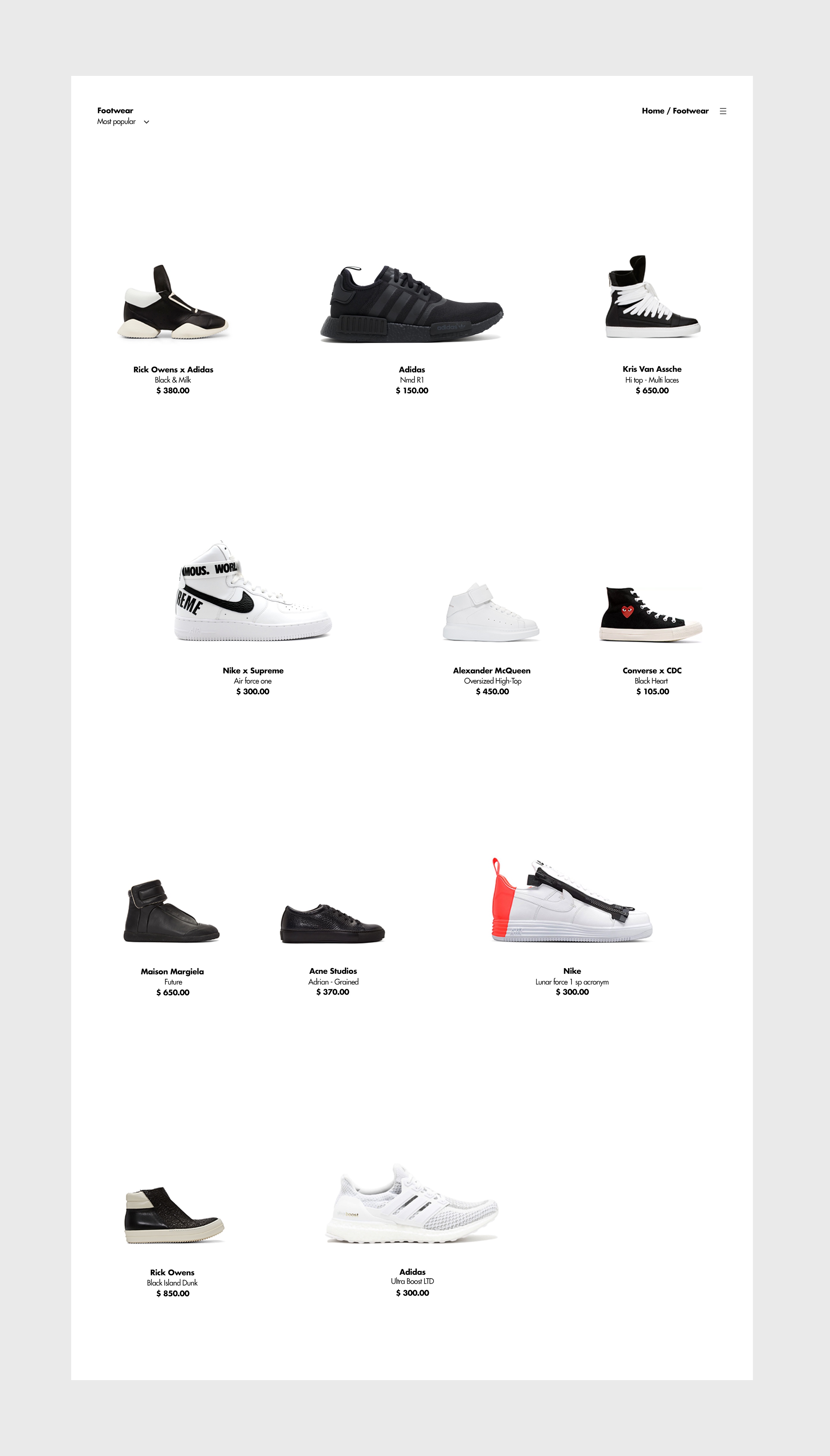
Drop is a project completed in 2018 and was a continuation of the work done on the Mura project. It is a clothing and accessories e-commerce, in between street wear and luxury clothing, drop offers products with strong and varied styles.
2018
User Interface
User Experience
Interactive Design
Responsive
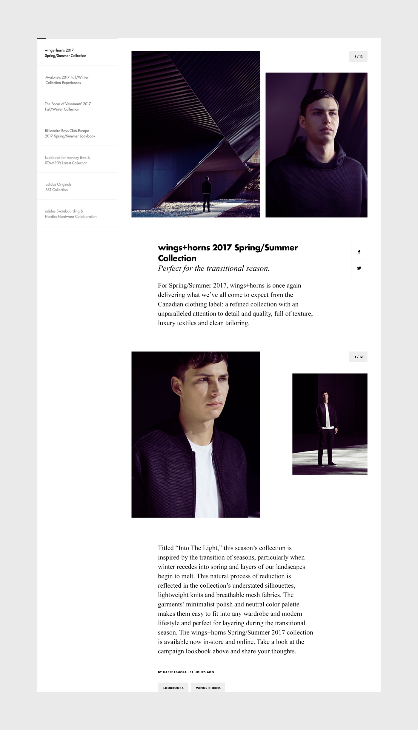
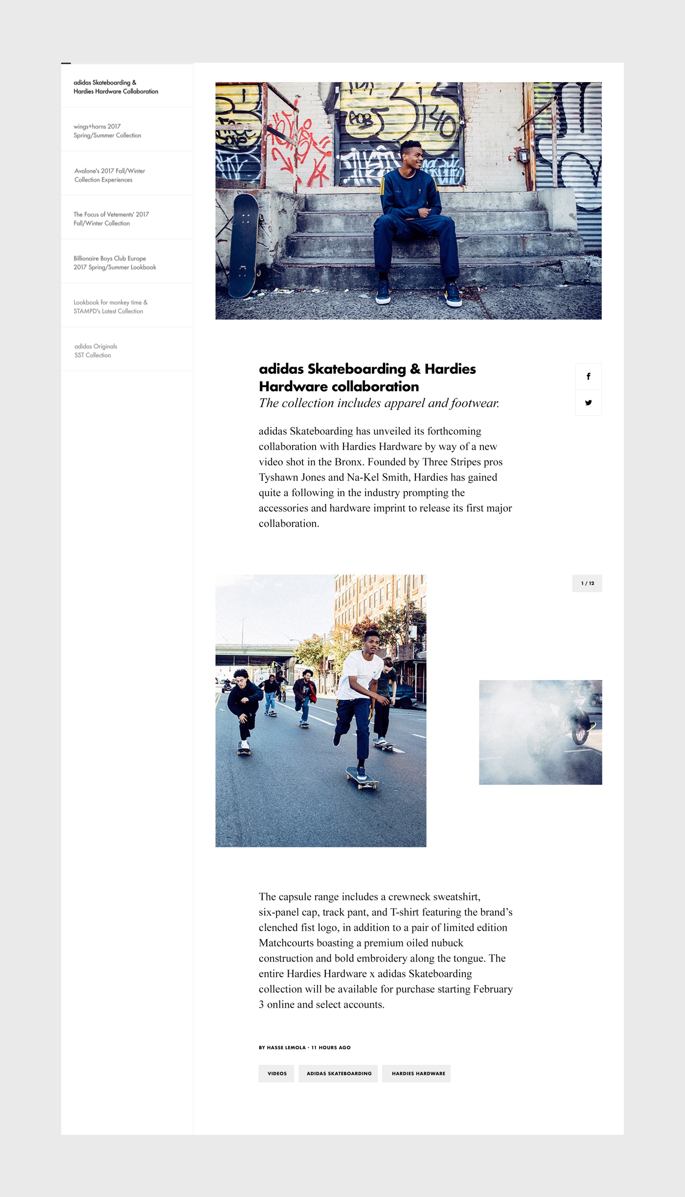
This project explores different types of content with help of interactions and animations to showcase clothes. I started with print graphic design codes borrowed from “Grid system by Josef Muller- Brockmann”.
The screen size (1280 px / 720 px) is defined by vertical (8 columns) and horizontal (12 columns) grids. The pages are composed by a serie of key components formated within this grid. Visually Drop is minimal and contrasts are strong, B&W are in opposition and the Futura typeface adds an unique branding style. Designing in motion was the core of this project, while instinctive navigation was key to achieve maximum usability.
This project strengthened my idea of minimalism as the best approach to efficient interaction design.
