Mura
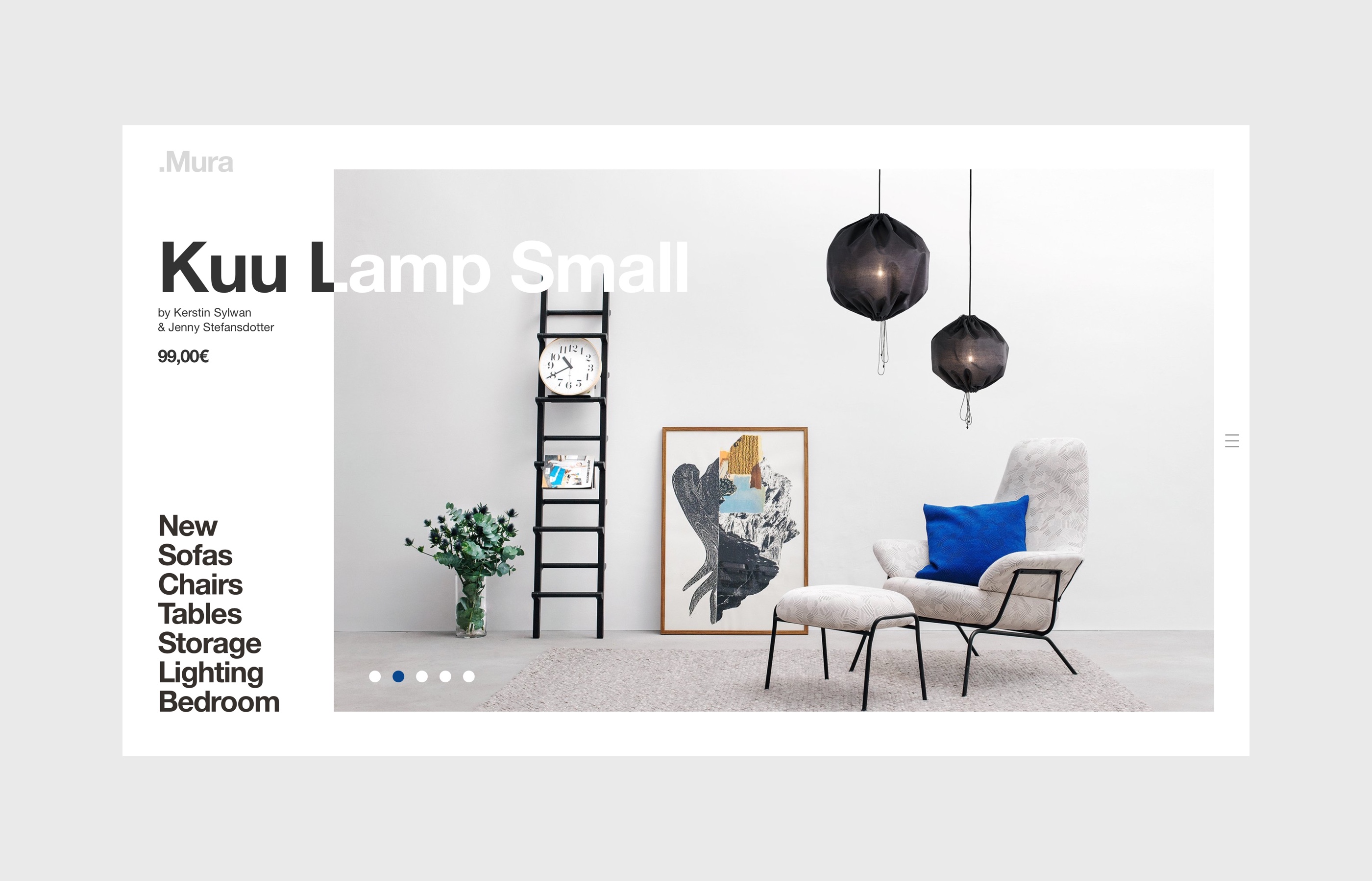
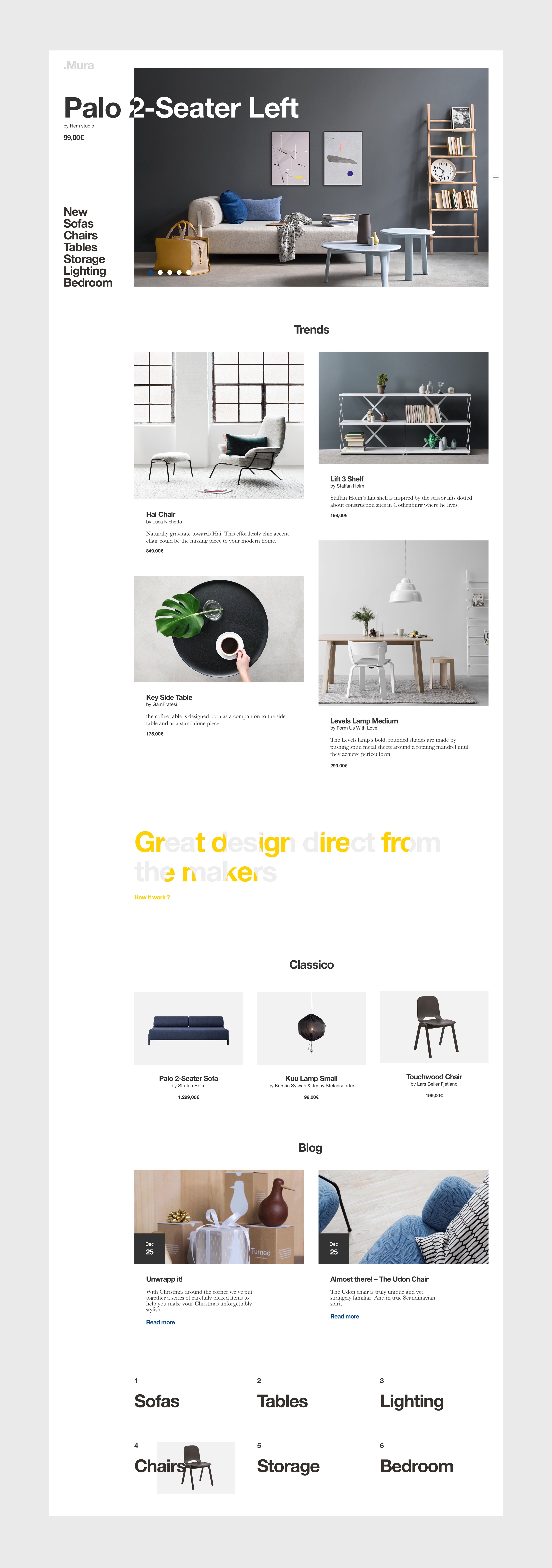
« Great design direct from the maker ». Mura is a project released in 2017. It’s a marketplace where designers & makers can sell their work.
2016
User Interface
User Experience
Interaction Design
Grid System
It started from the idea to create a website in an unconventional way.
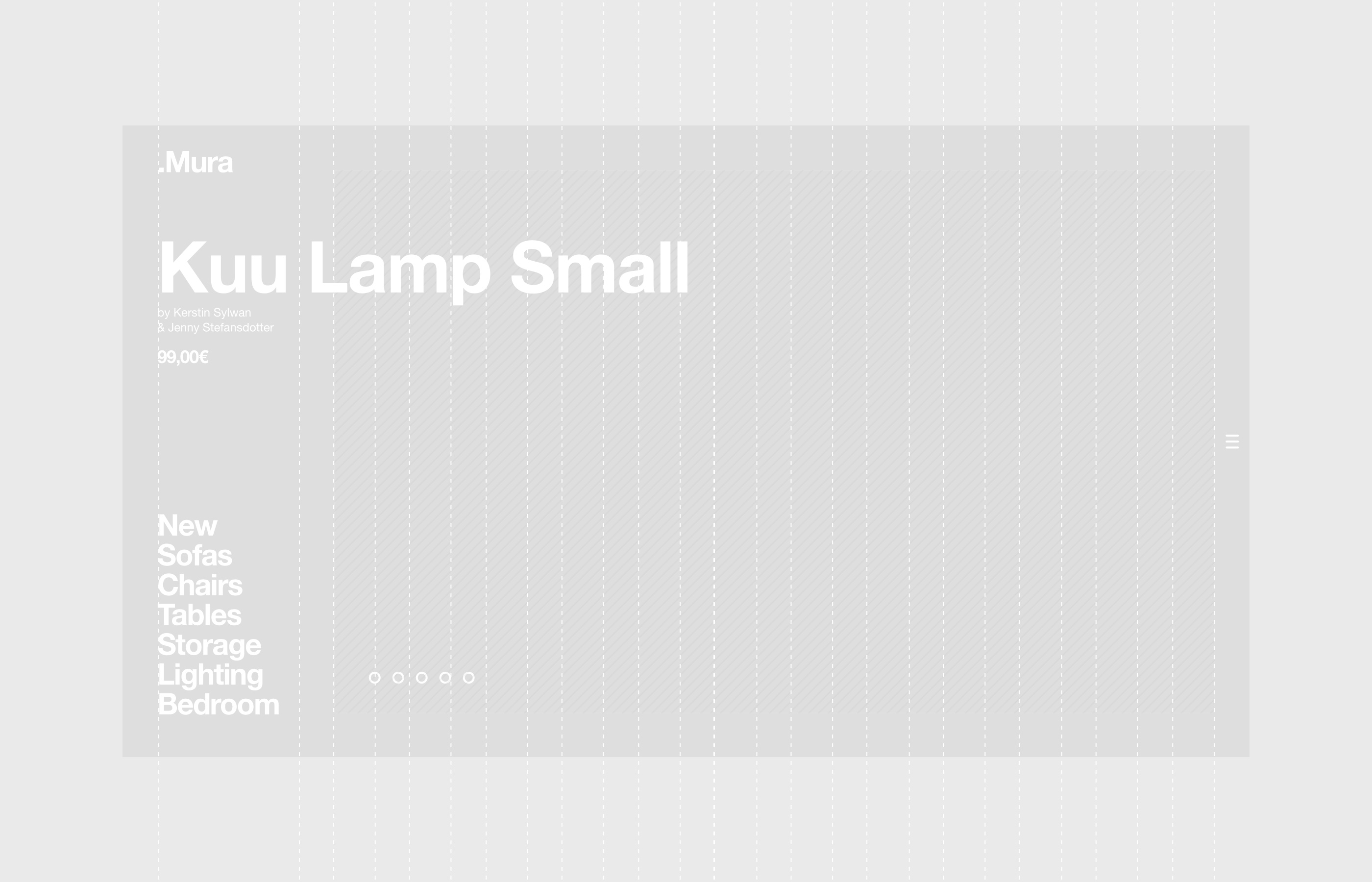
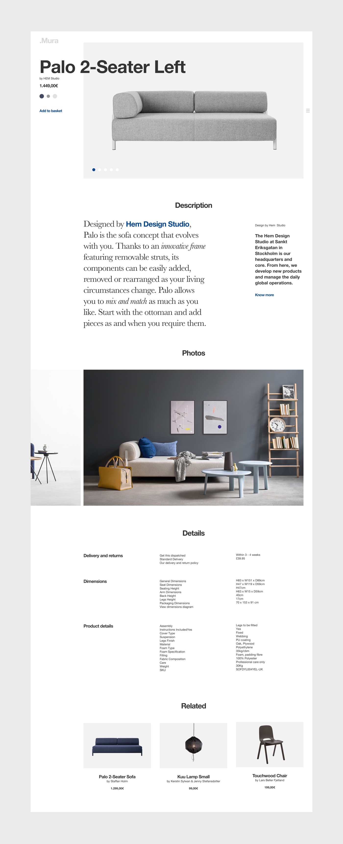
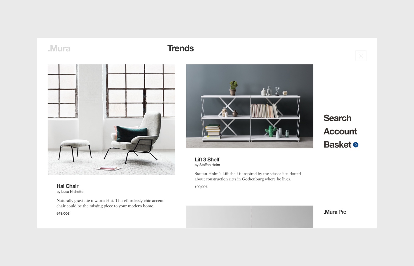
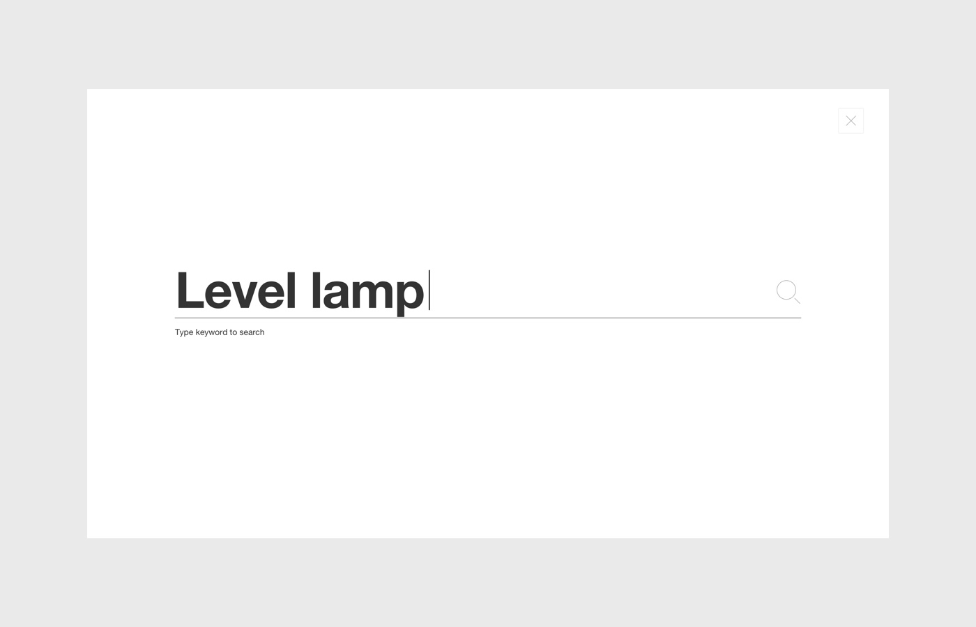
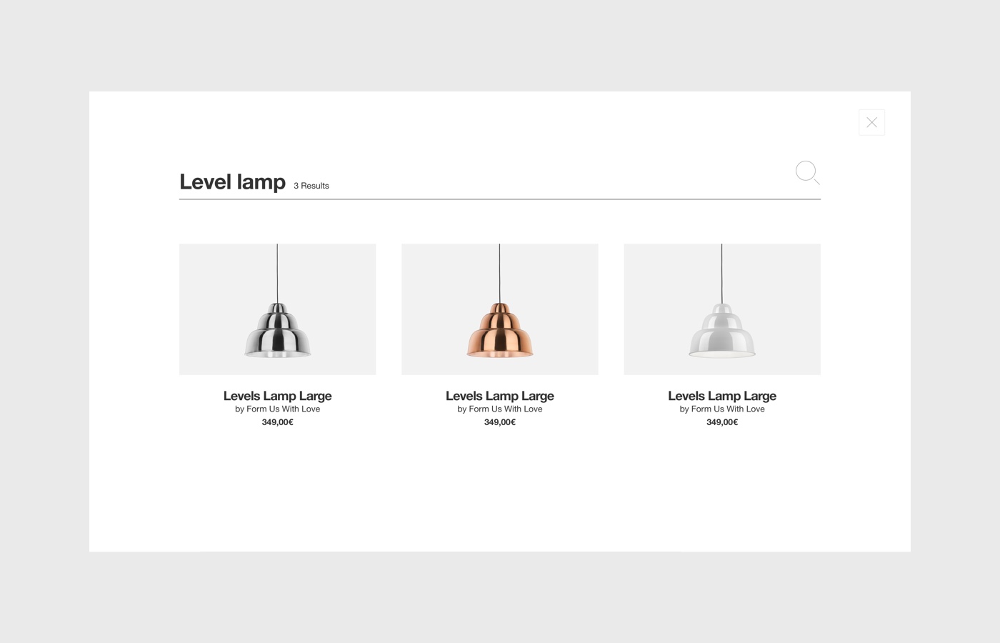
Mura is constructed with a specific grid and interactions.
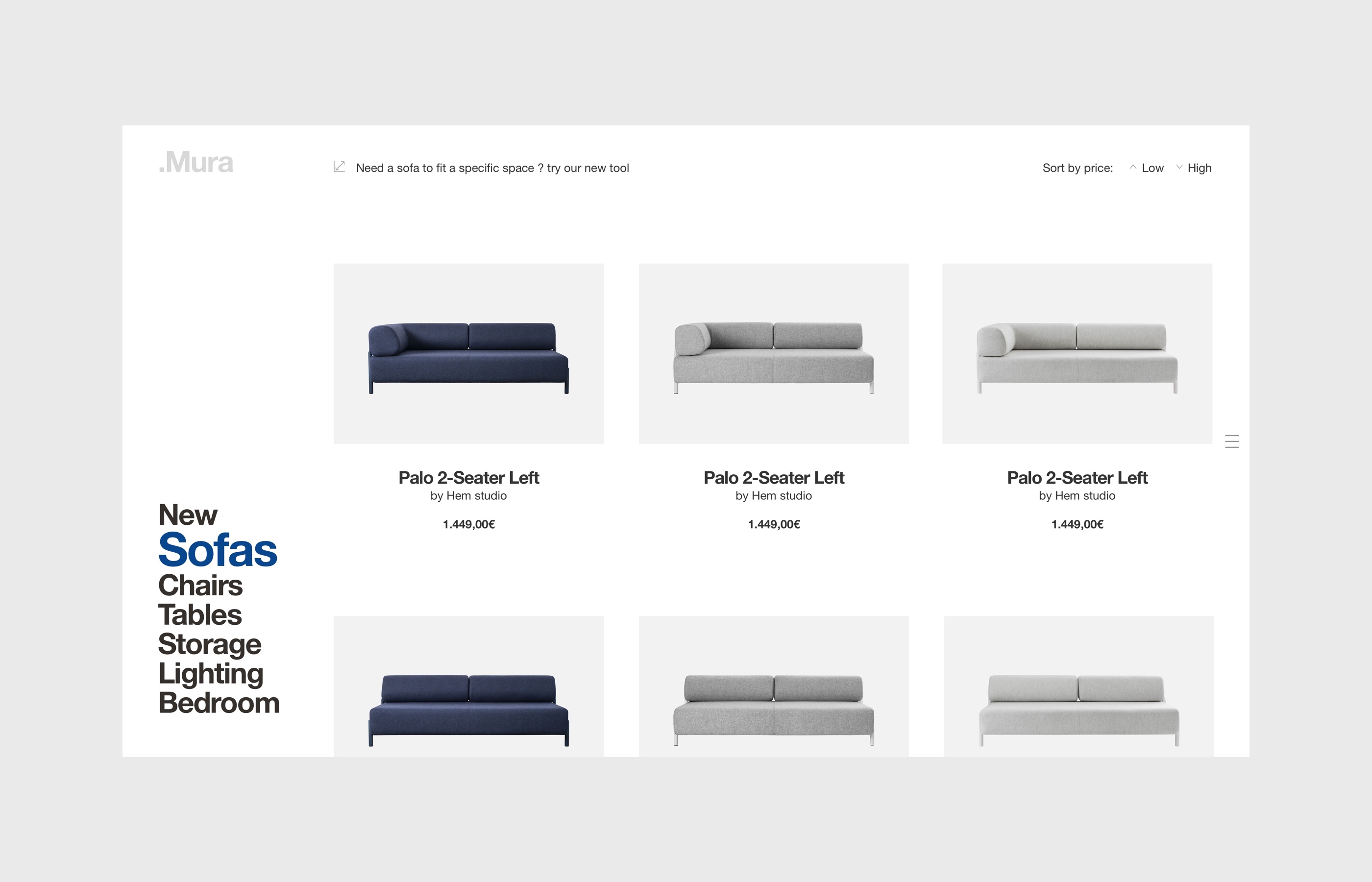
The style is minimal: a simple helvetica and photographs to highlight the products. With this project I tried to challenge my approach by thinking and building differently. I did this project with a focus on interaction design as a fundamental asset.
