2017 Medium
Onefinestay
The brand, specializing in high-end property rentals, was looking to improve its product.
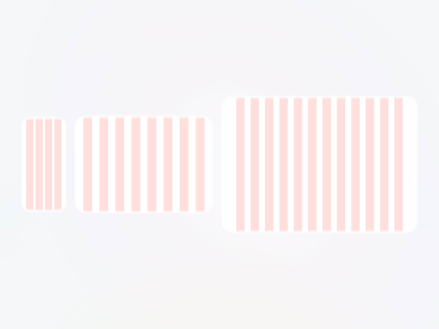
Our goal was to align the design with the brand's style and incorporate best practices in product design. We also developed a simple design system to ensure visual consistency.
User tests on the previous version revealed several issues that impacted conversion. While the user flow was functional, there were many ergonomic flaws.
Therefore, we decided to start with an MVP focused on the key parts of the site. This MVP aimed to fix usability issues while staying true to the brand identity.
Branding
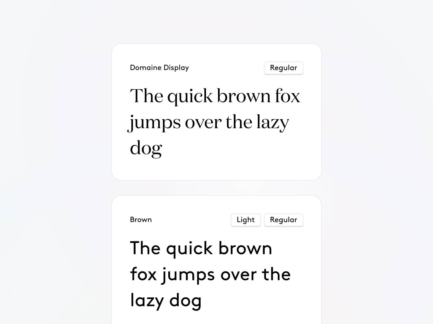
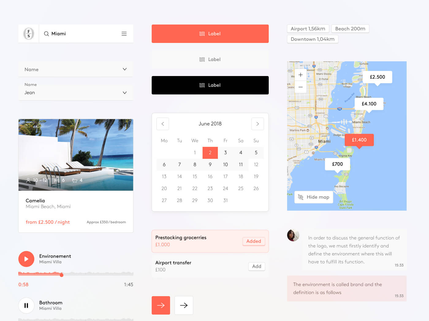
Our first task was to rationalize the brand identity: colors, typography, components, and icons. We kept the brand’s signature orange, which is present throughout the branding.

Search
The first product project we tackled was focused on search.
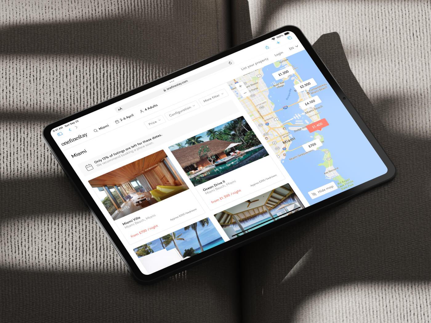
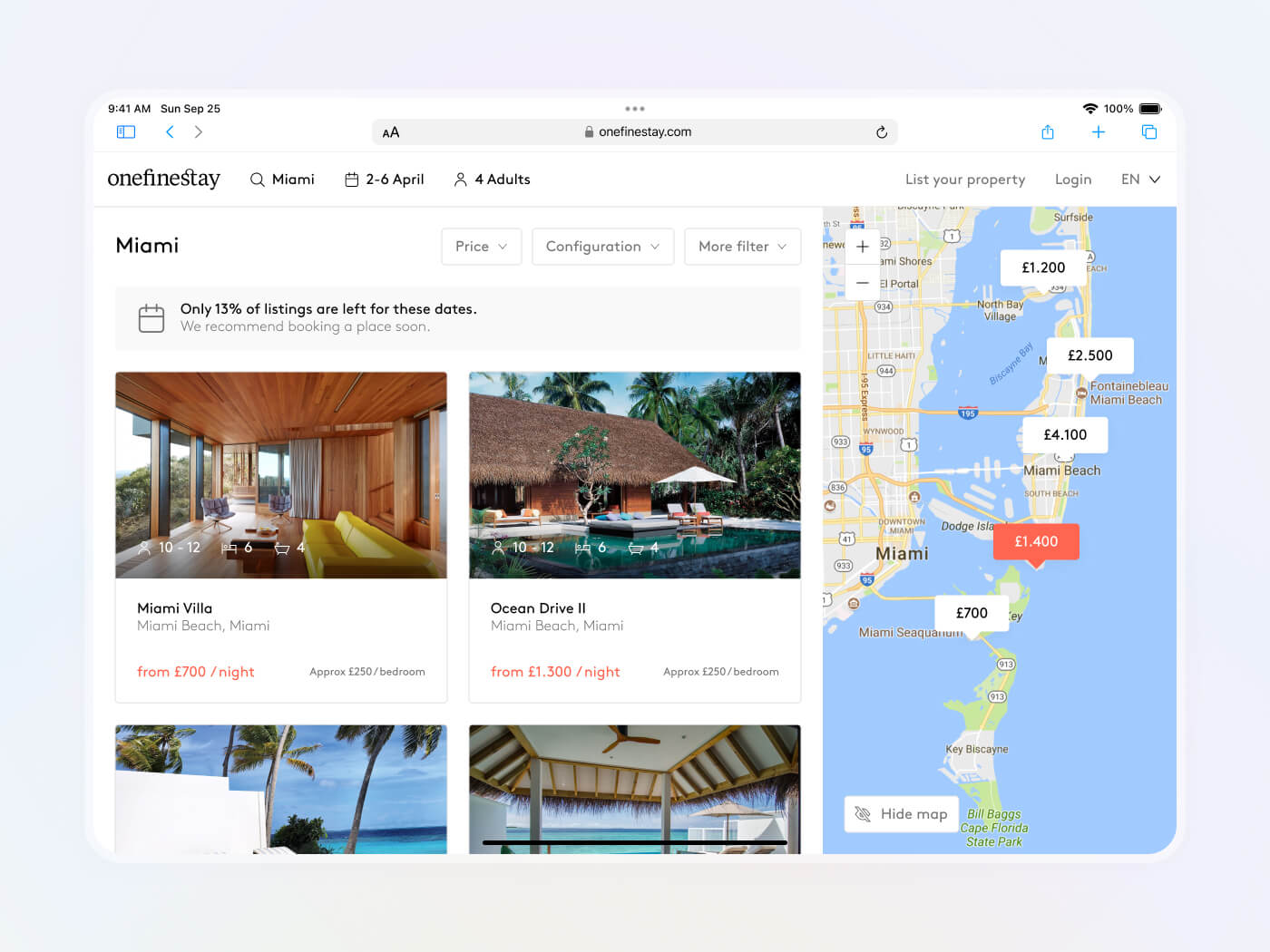
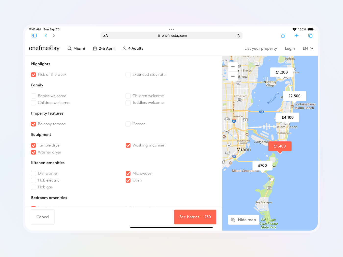
On desktop, the left side of the screen displays the listings, while the right side shows their location on a map.
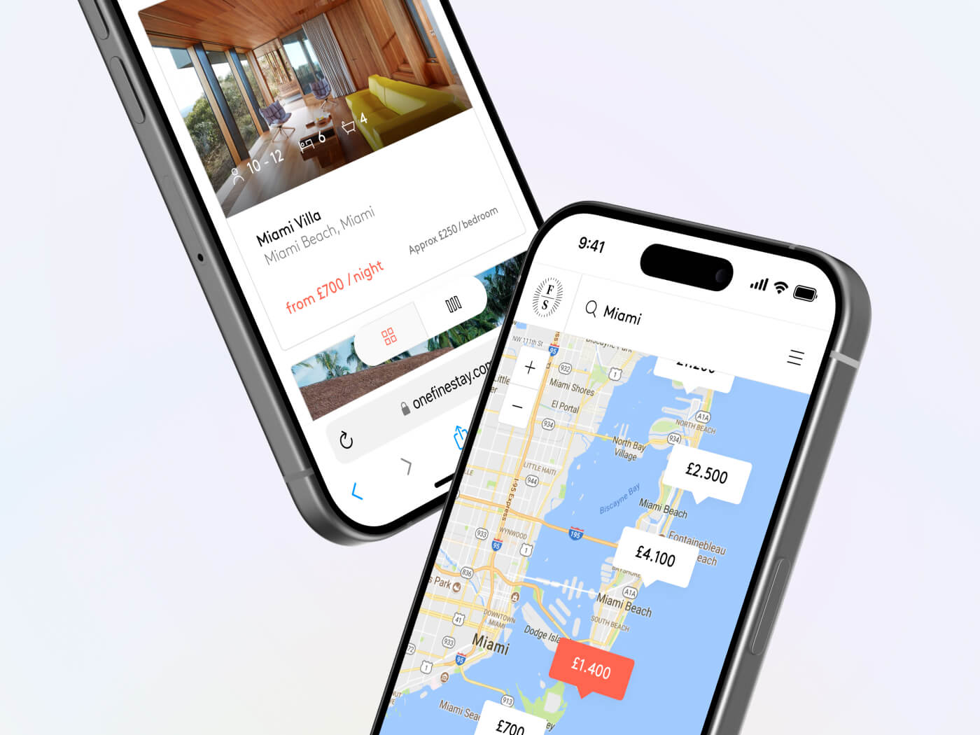
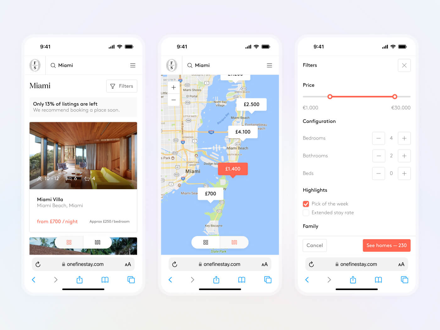
On mobile, we added a switch button to toggle views.
Property page
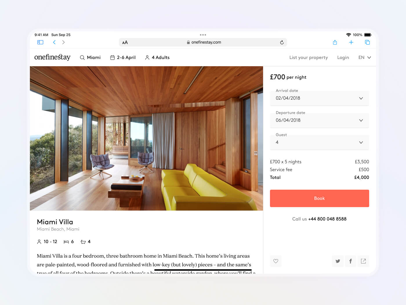
Clicking on a listing opens the property page, providing more photos, features, and information about the location, amenities, and surroundings.
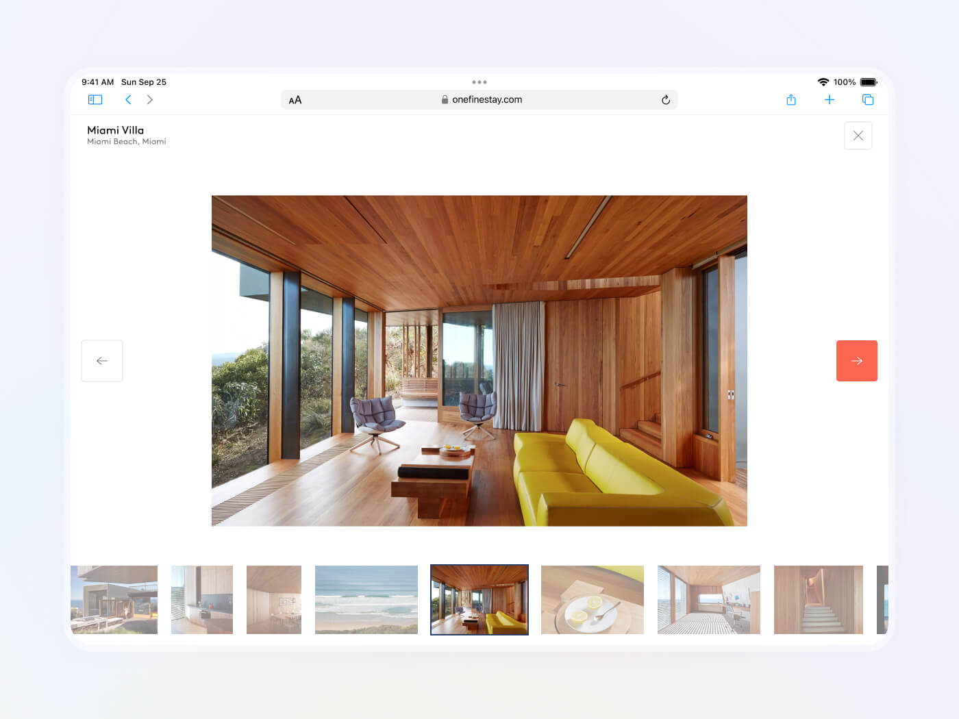
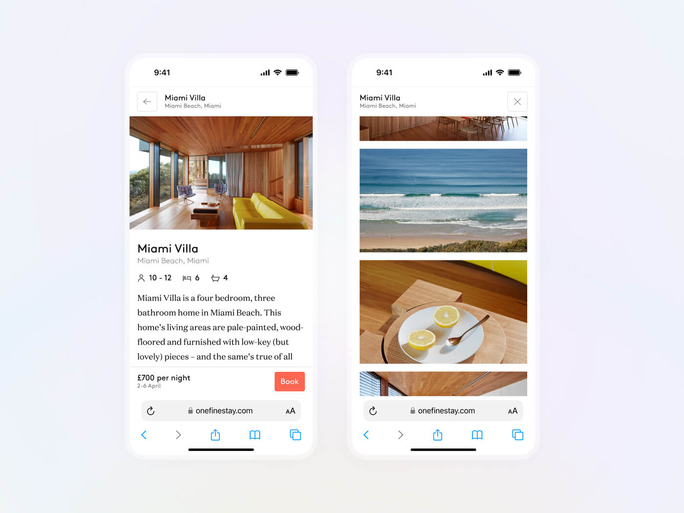
Booking
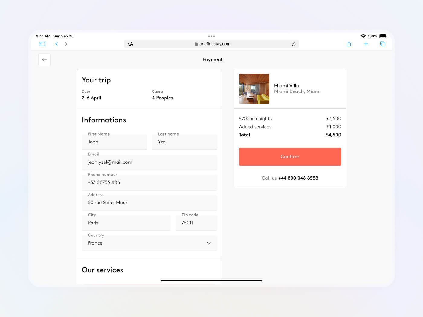
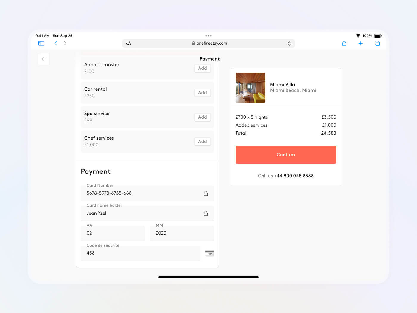
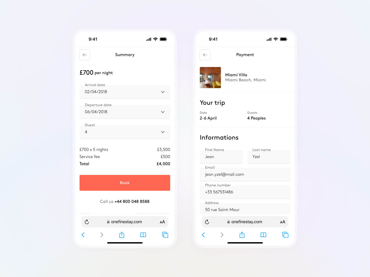
Clicking on "Book" takes the user to the payment process, where they enter their details.
Account
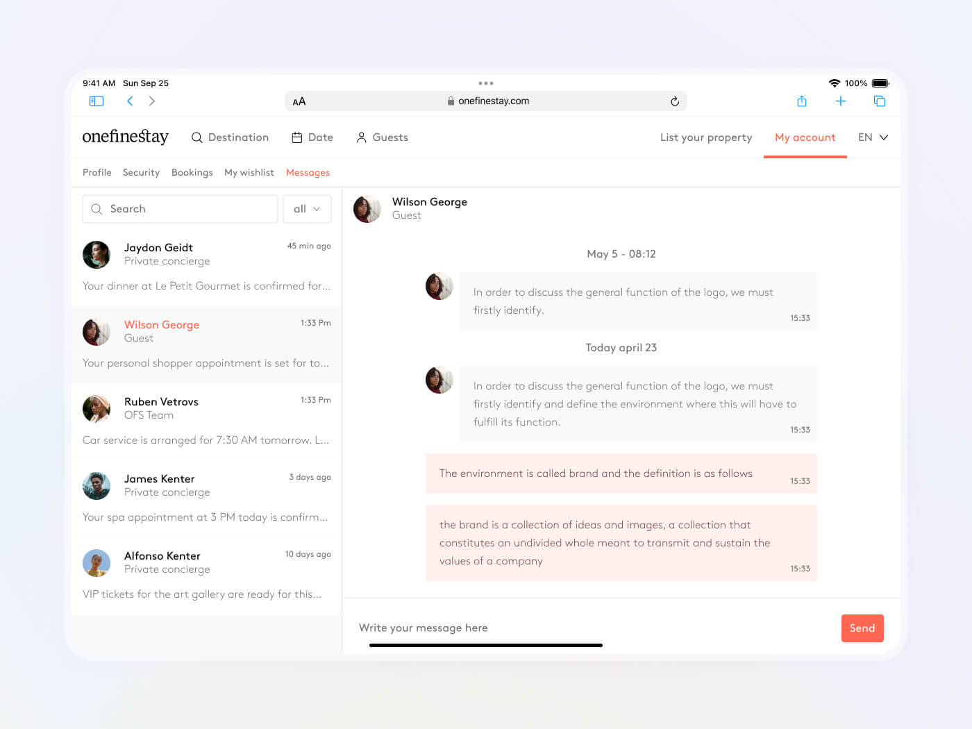
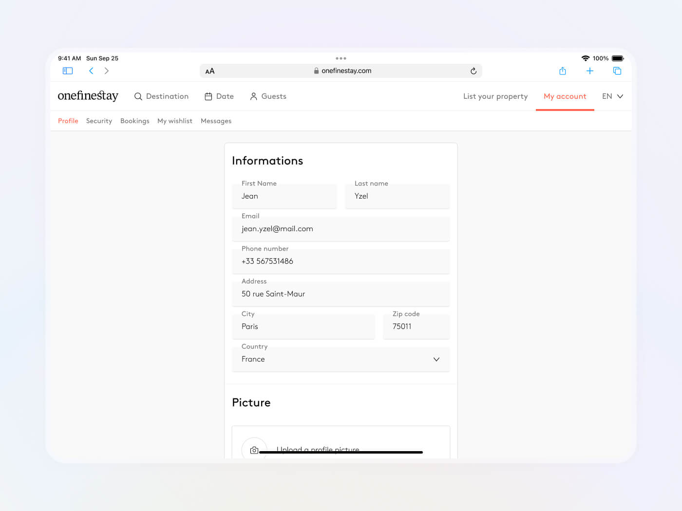
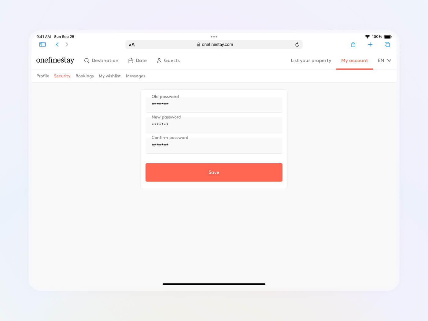
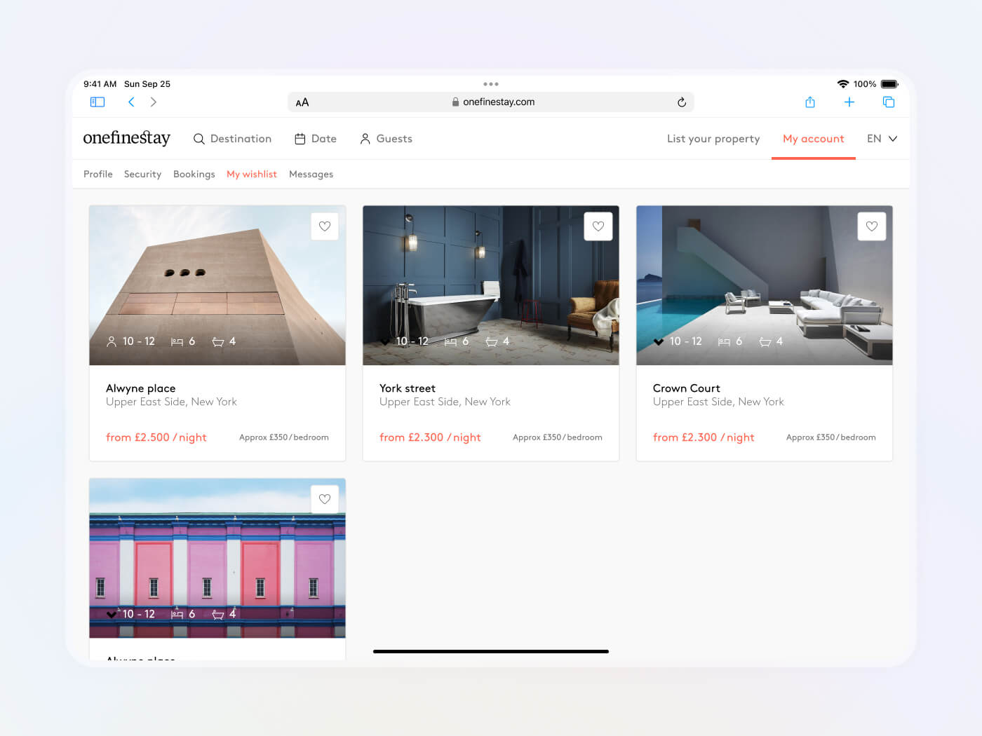
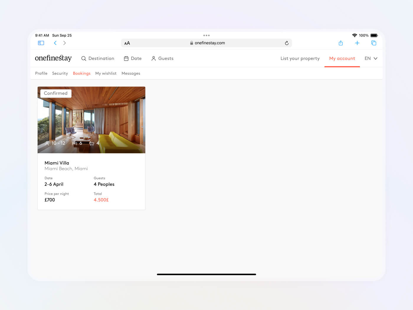
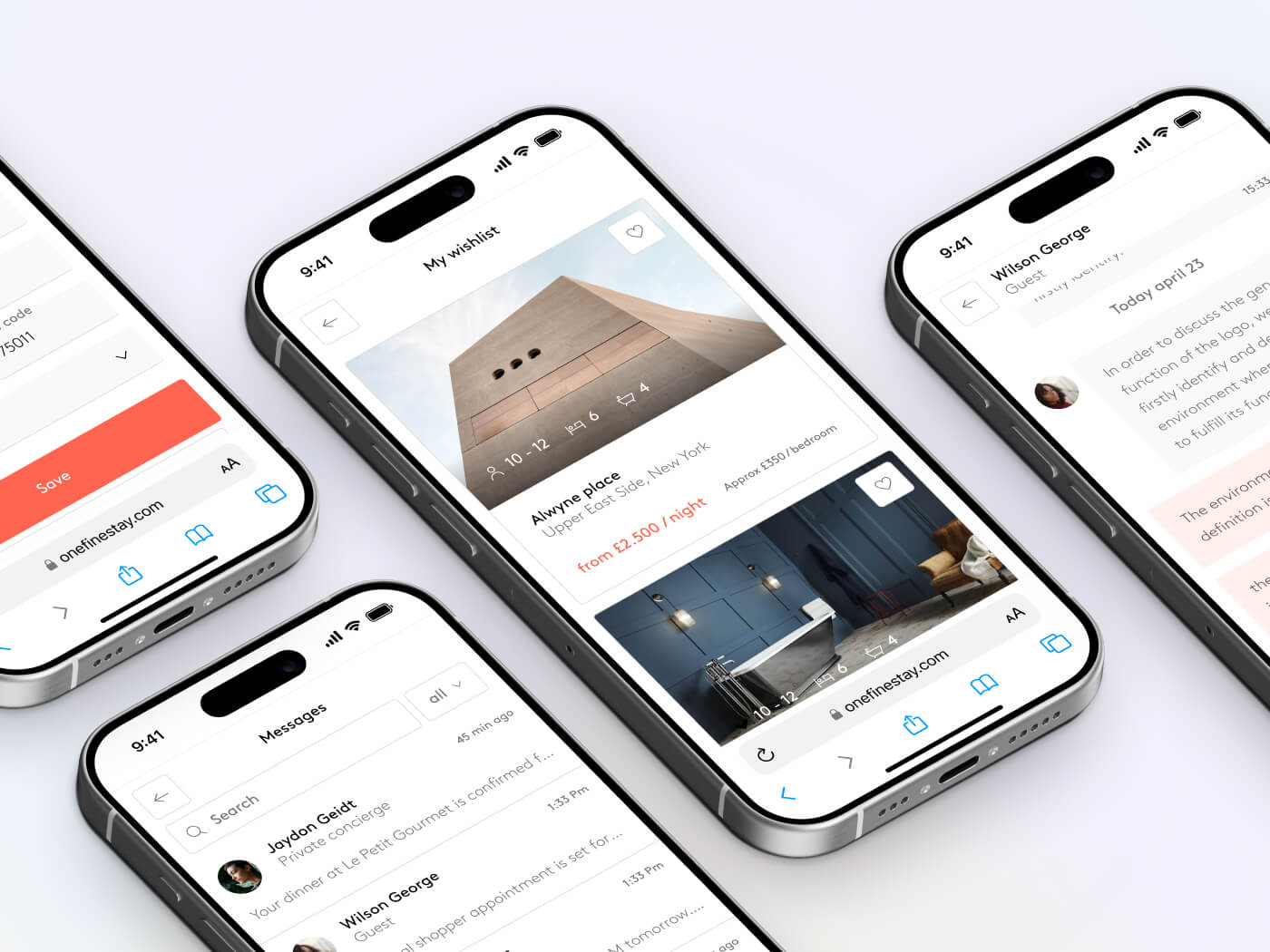
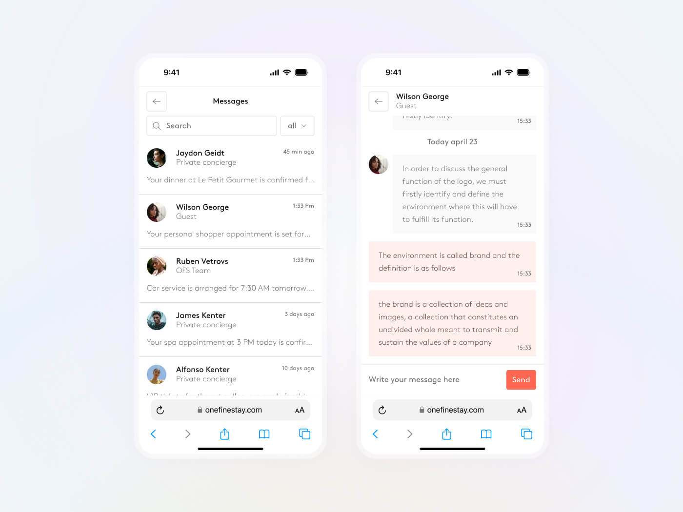
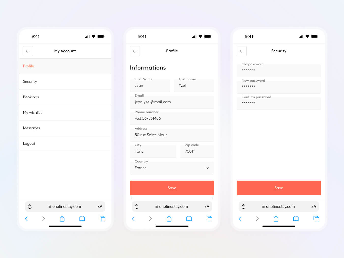
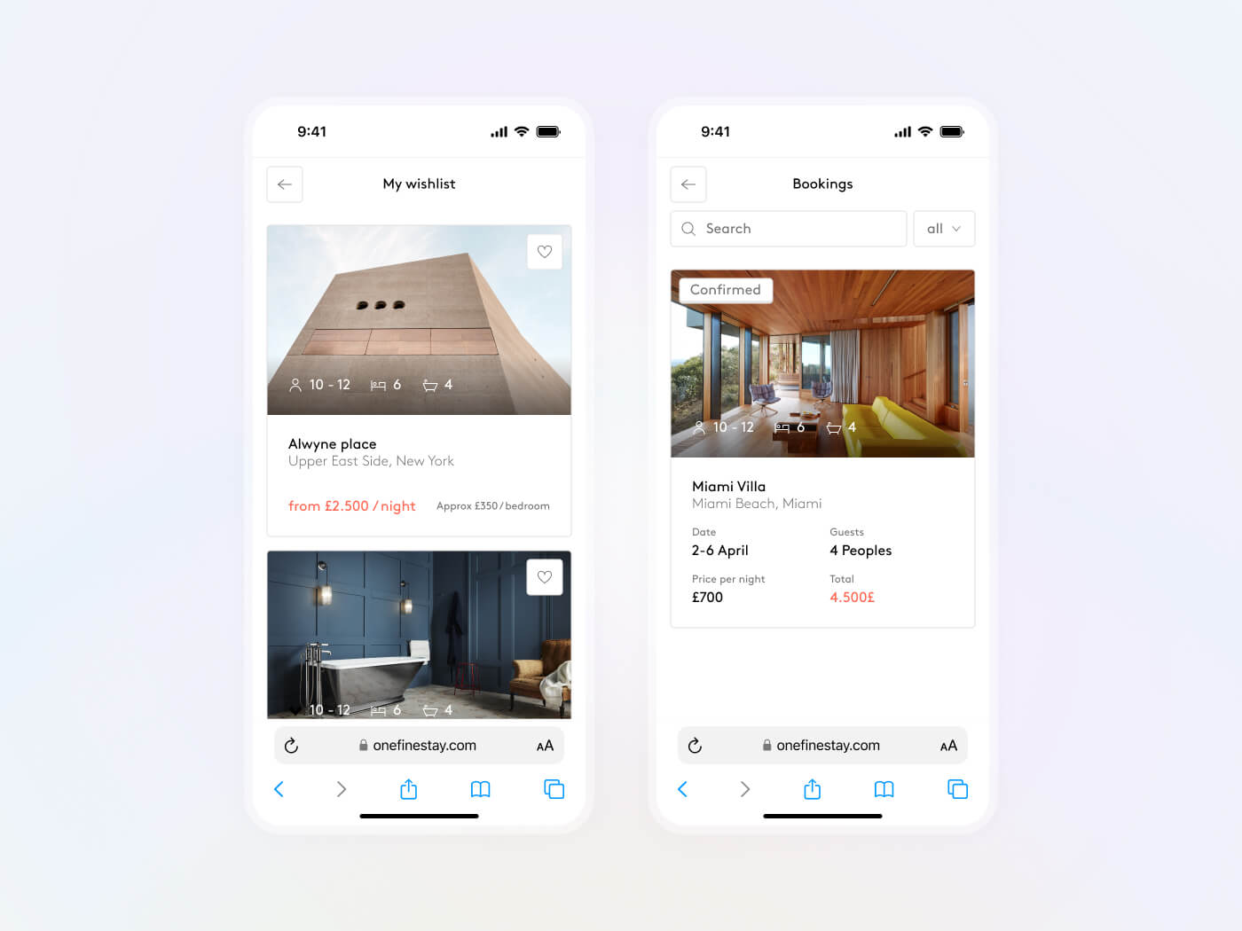
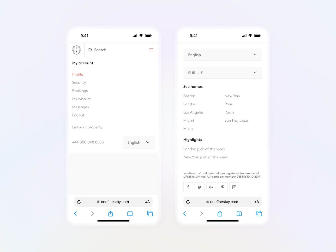
Next, we explored the user account section, allowing users to edit their information, track their bookings, and communicate with concierges via messaging.
Landing
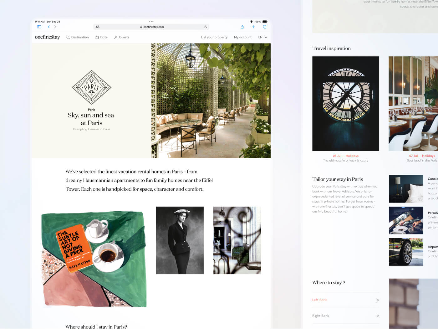
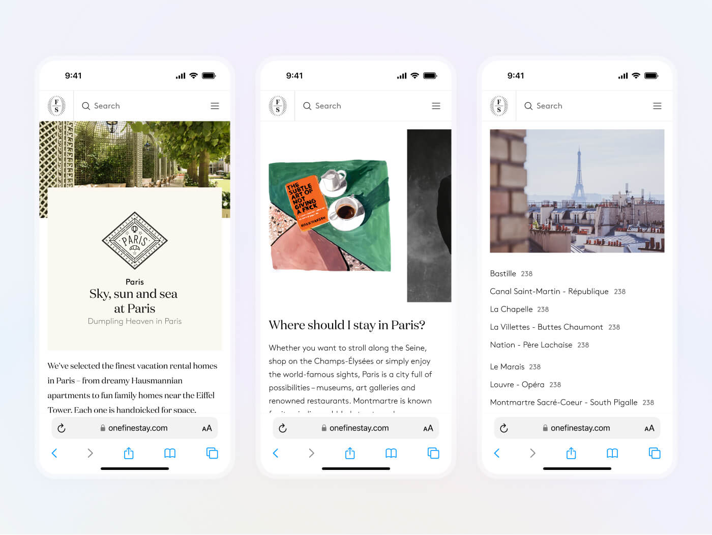
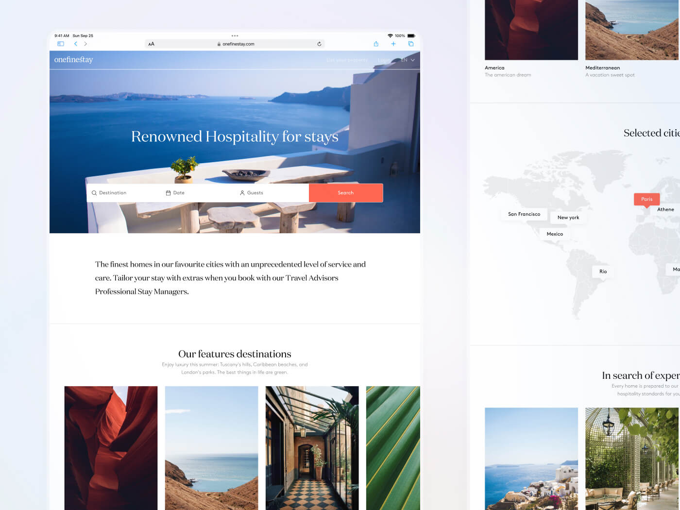
We also designed an immersive landing page, highlighting the available properties, the brand's international presence, and the services offered.
Navigation
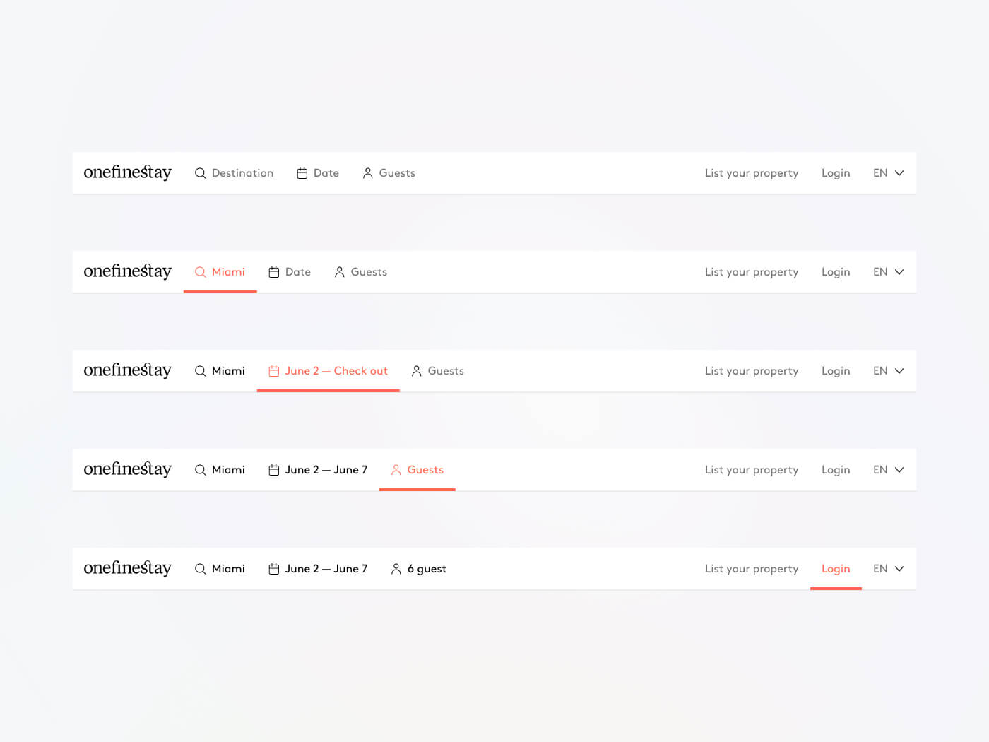
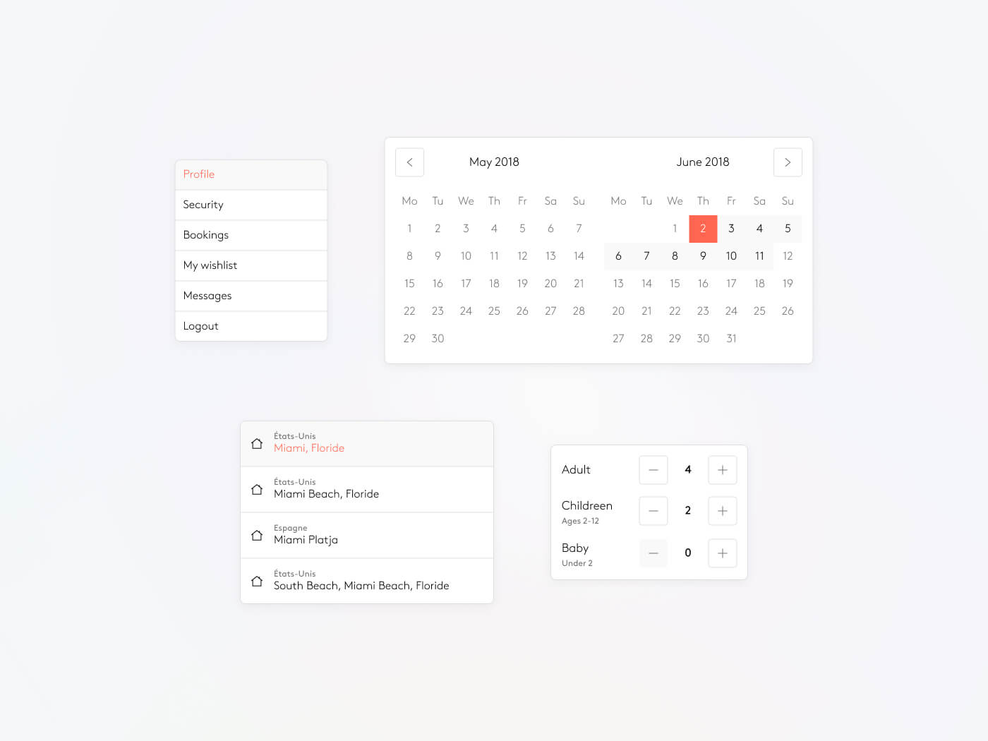
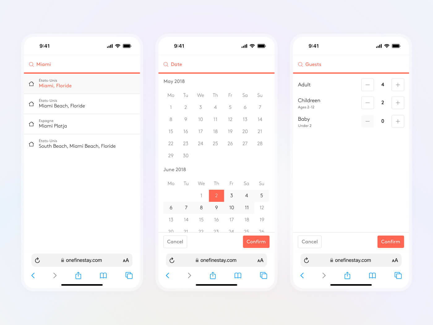
The landing page serves as the entry point to the search, which is divided into three parts: location, date, and guests.
Articles
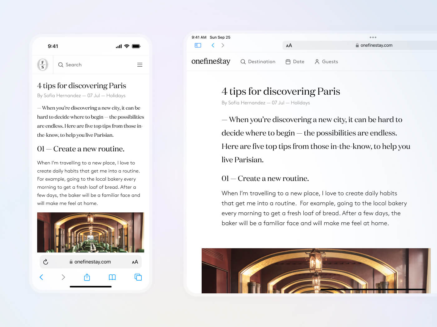
Finally, we developed a concept of articles to editorialize the property pages and set the 'mood.' These articles are accessible from both the landing page and the properties pages.
