2019-2024 Medium
Sorare Design System
Throughout my journey at Sorare, I had the opportunity to develop and improve the design system.
In 2023, following a navigation reorganization project, the entire Sorare experience was optimized, and the design system also evolved to better meet the product's needs.
Structure
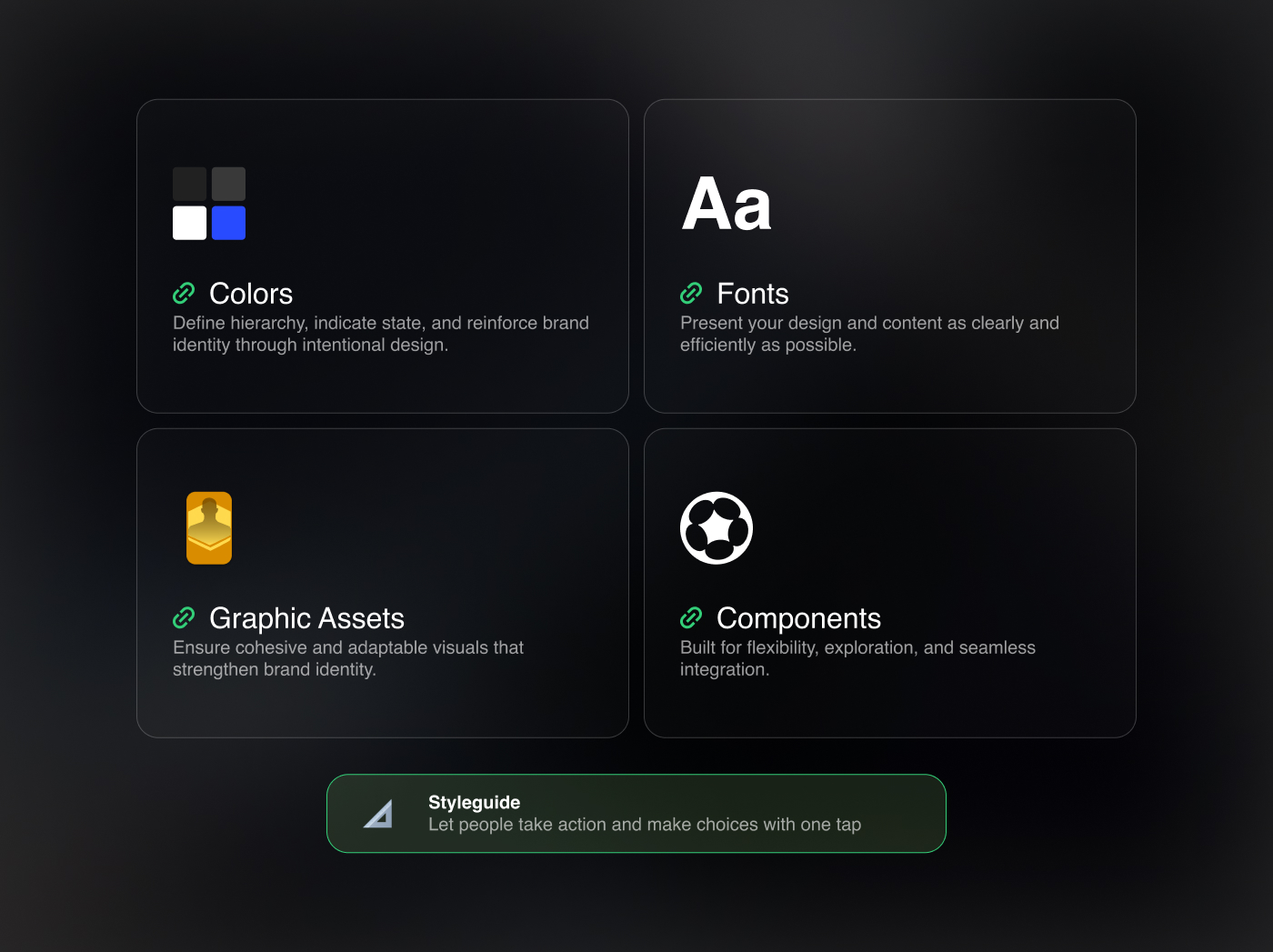
The design system is structured into four main files: colors, typography, graphic assets, and components. These files are designed for use in both web and native design. A styleguide file outlines the system’s choices and principles.
This separation ensures clear foundations and minimizes the risk of introducing critical errors. The files dedicated to colors or typography, are not meant to be frequently modified.
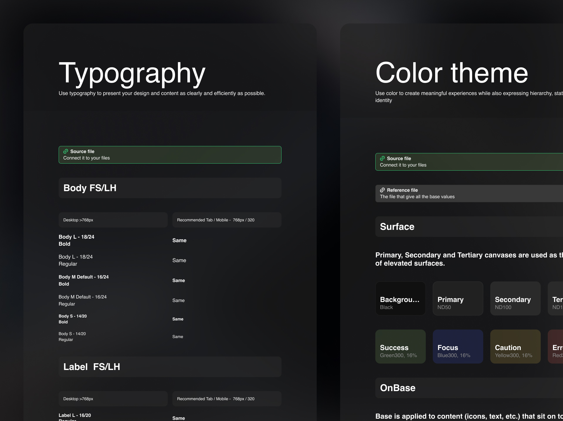
Typography
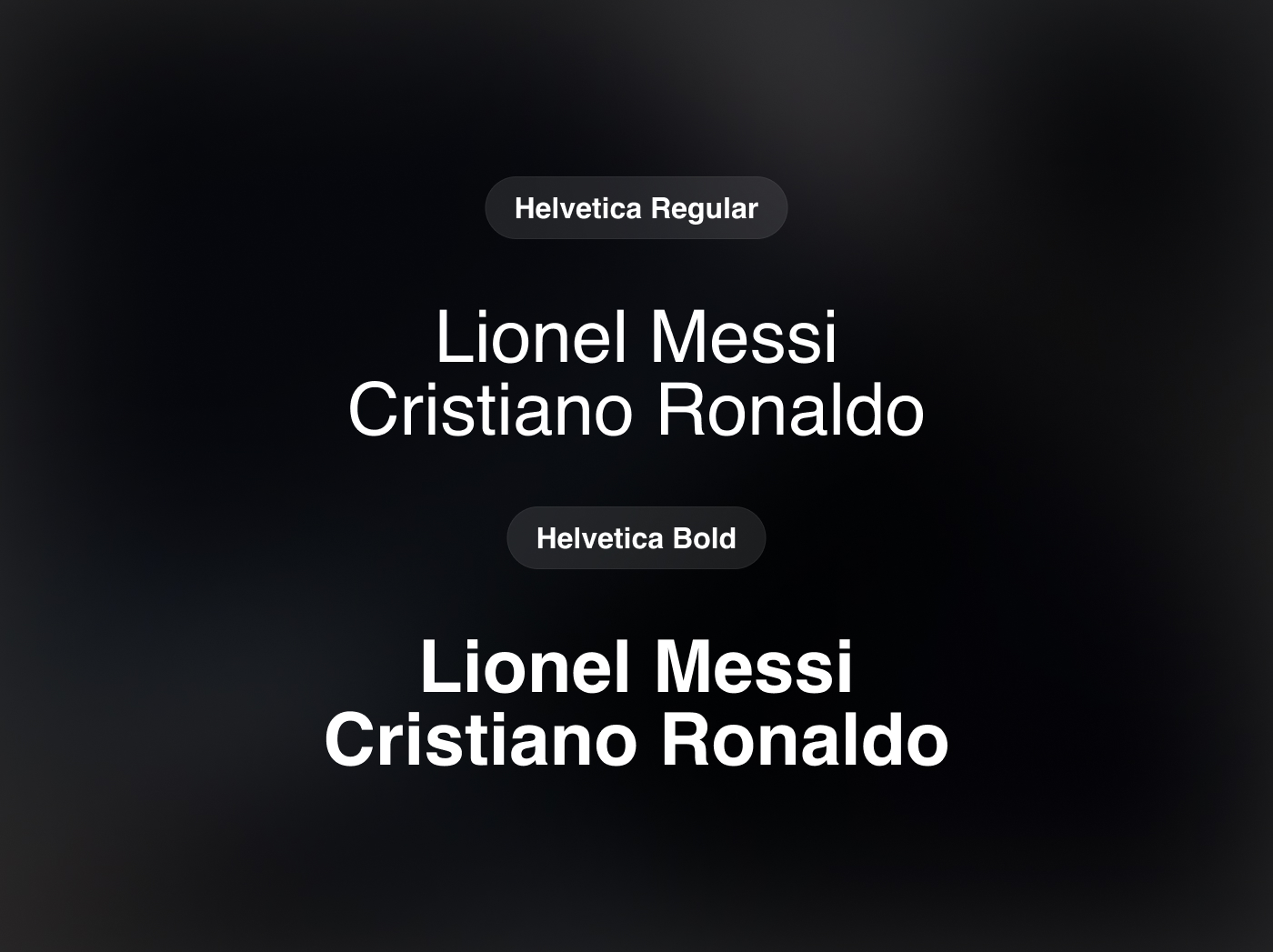
A minimalist approach was adopted with a single typeface: Helvetica, available in two weights (Regular and Bold).
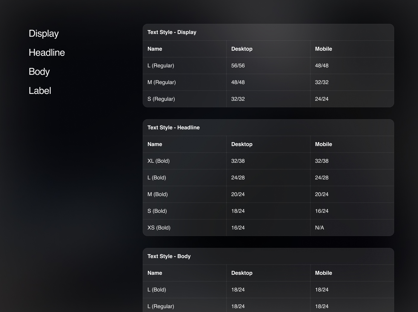
The file structure is organized by application: display, headline, body, and label. The goal was to create a clear and intuitive system, making choices obvious.
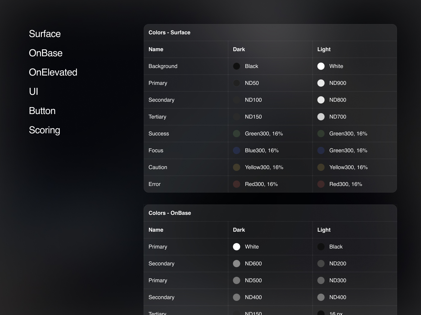
Colors
The color system is designed to work in both light and dark modes. With Figma's local variables, switching between the two modes is quick and seamless.
Colors are organized by their usage:
Surface: Shades for background surfaces.
OnBase: Applied to content (icons, text, etc.) on Background and Primary Containers.
Elevated: Applied to content on Secondary and Tertiary Containers.
UI: Used for strokes and separators.
Scoring: Dedicated to displaying player scores.
Buttons: For interactive buttons.
In terms of naming, we kept it neutral—no token explicitly mentions a color, ensuring greater adaptability.
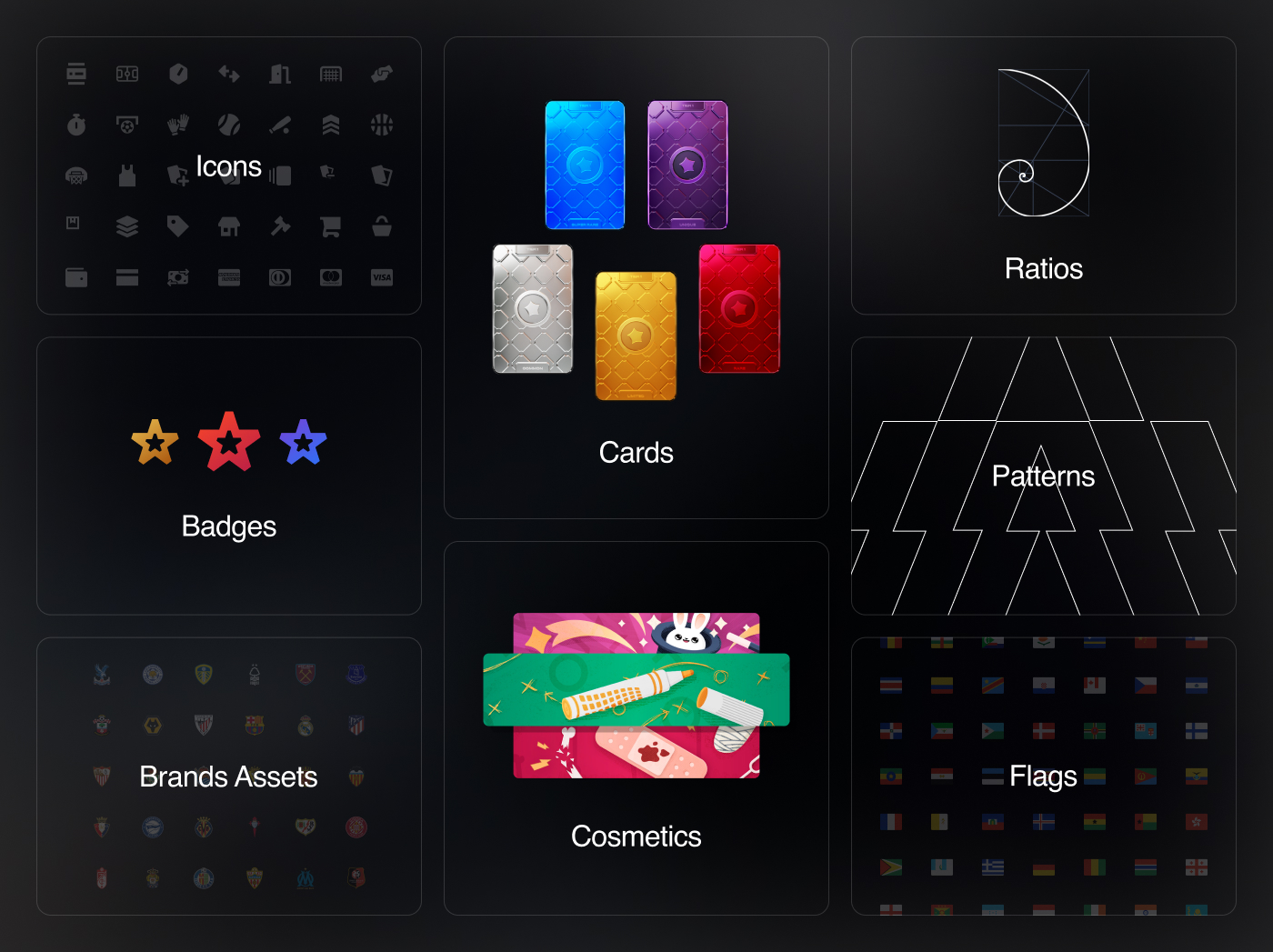
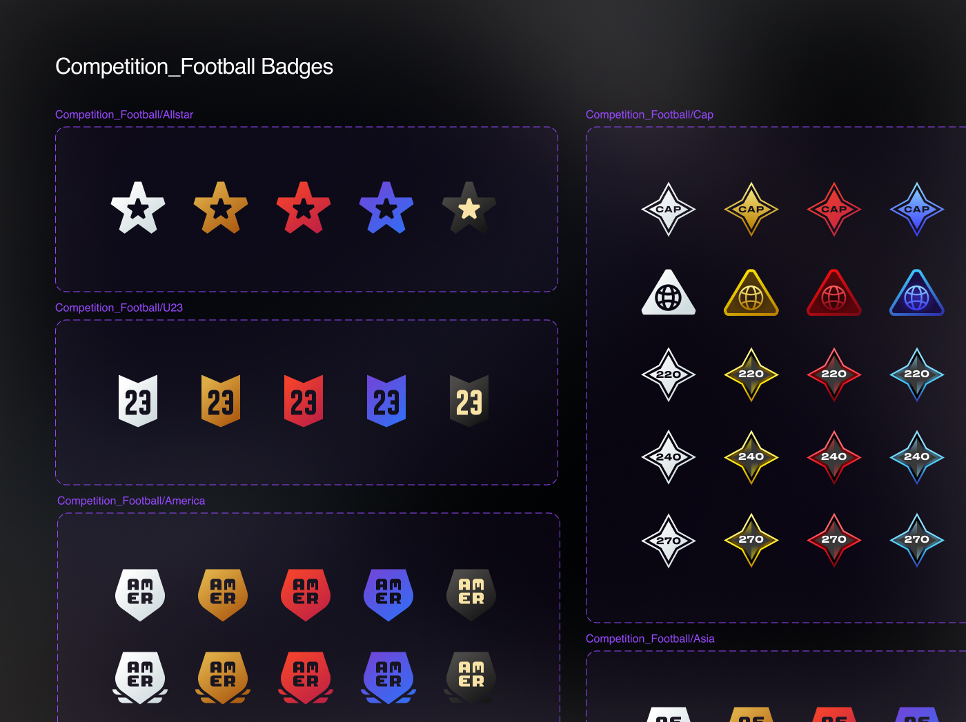
Graphic Assets
This includes all graphic elements: icons, badges, branding elements, cosmetics, cards, ratios, patterns, etc. It is a library consisting of graphic components with multiple variables, serving as a source of assets.
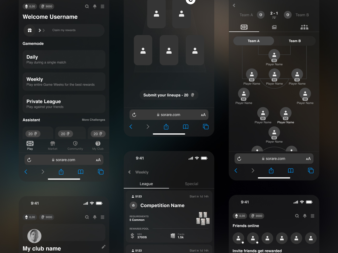
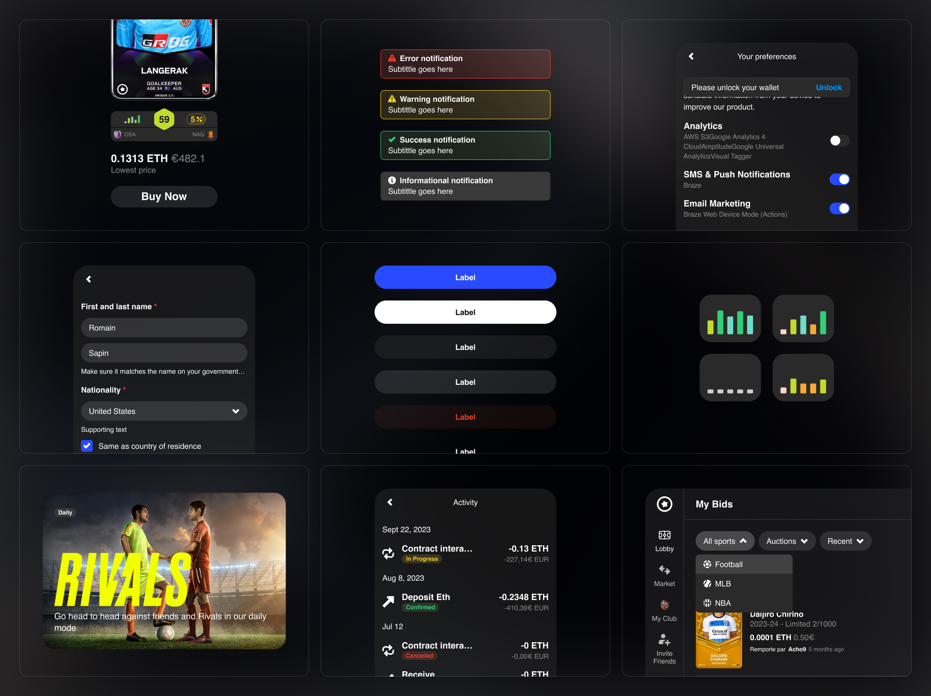
Components
This file brings together all the main components, with the idea of providing a toolkit of essential elements without restricting the creativity of designers.
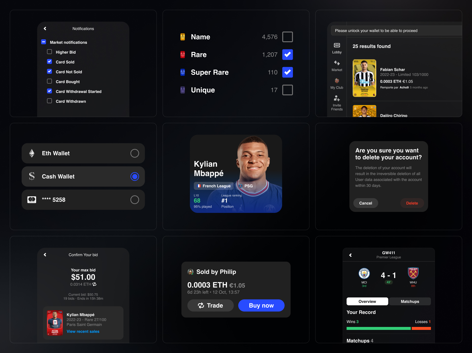
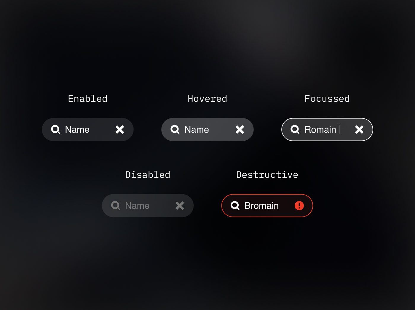
Component doc
Each component is accompanied by a detailed sheet outlining its structure, variables, usage, and practical examples. All components are available in both web and native versions.
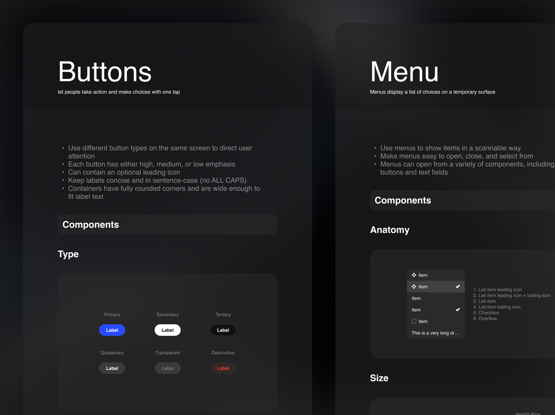
Detailed sheet
Construction
Variables
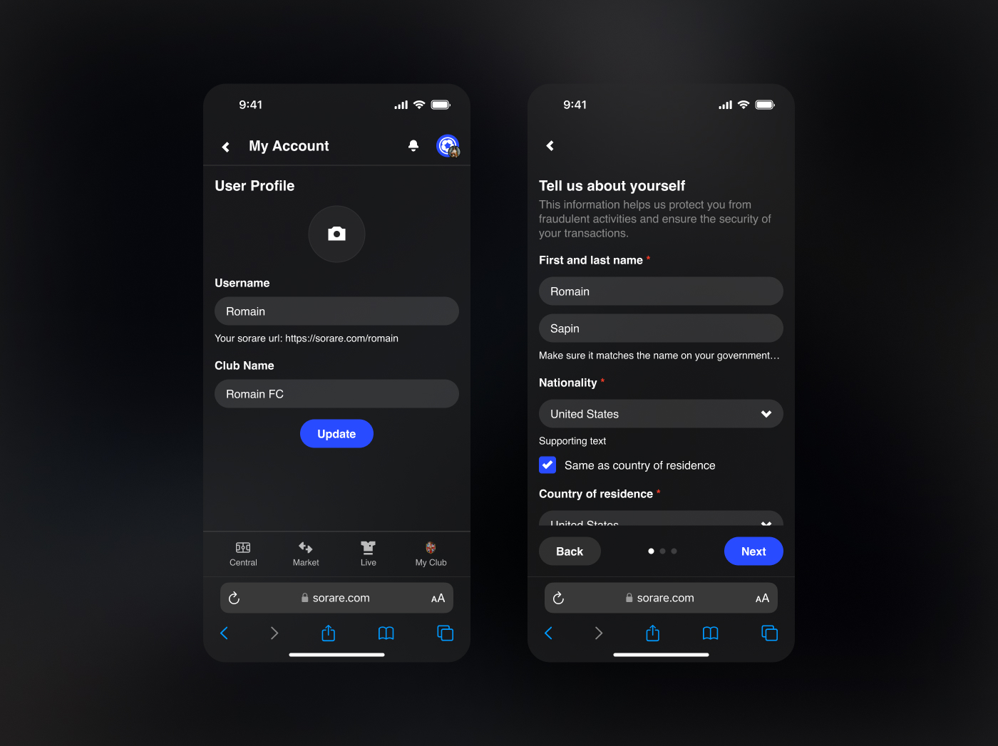
Practical examples
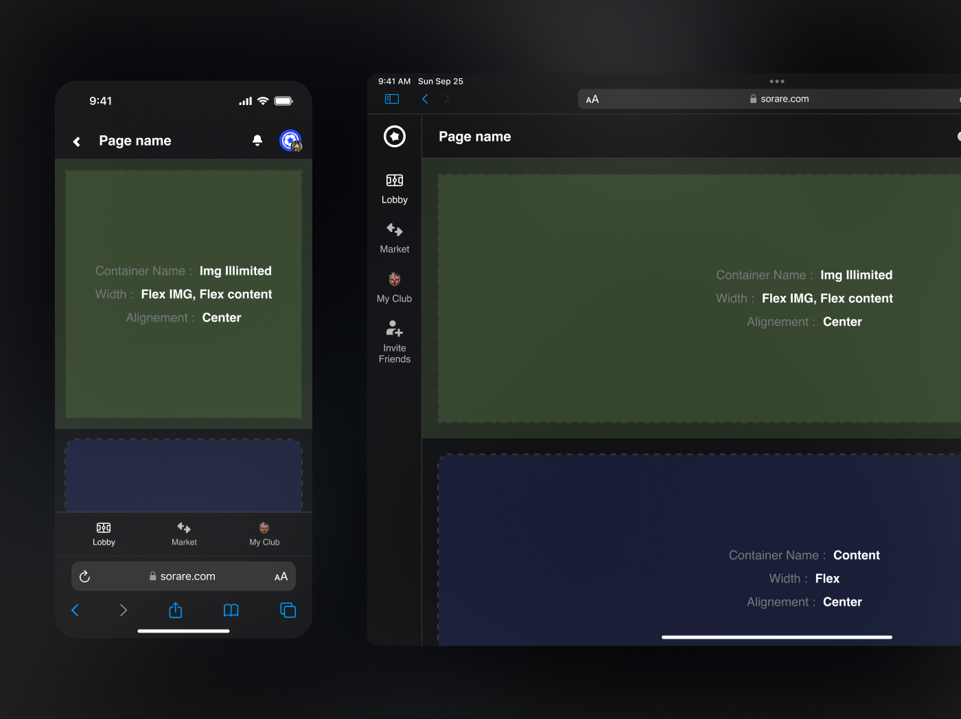
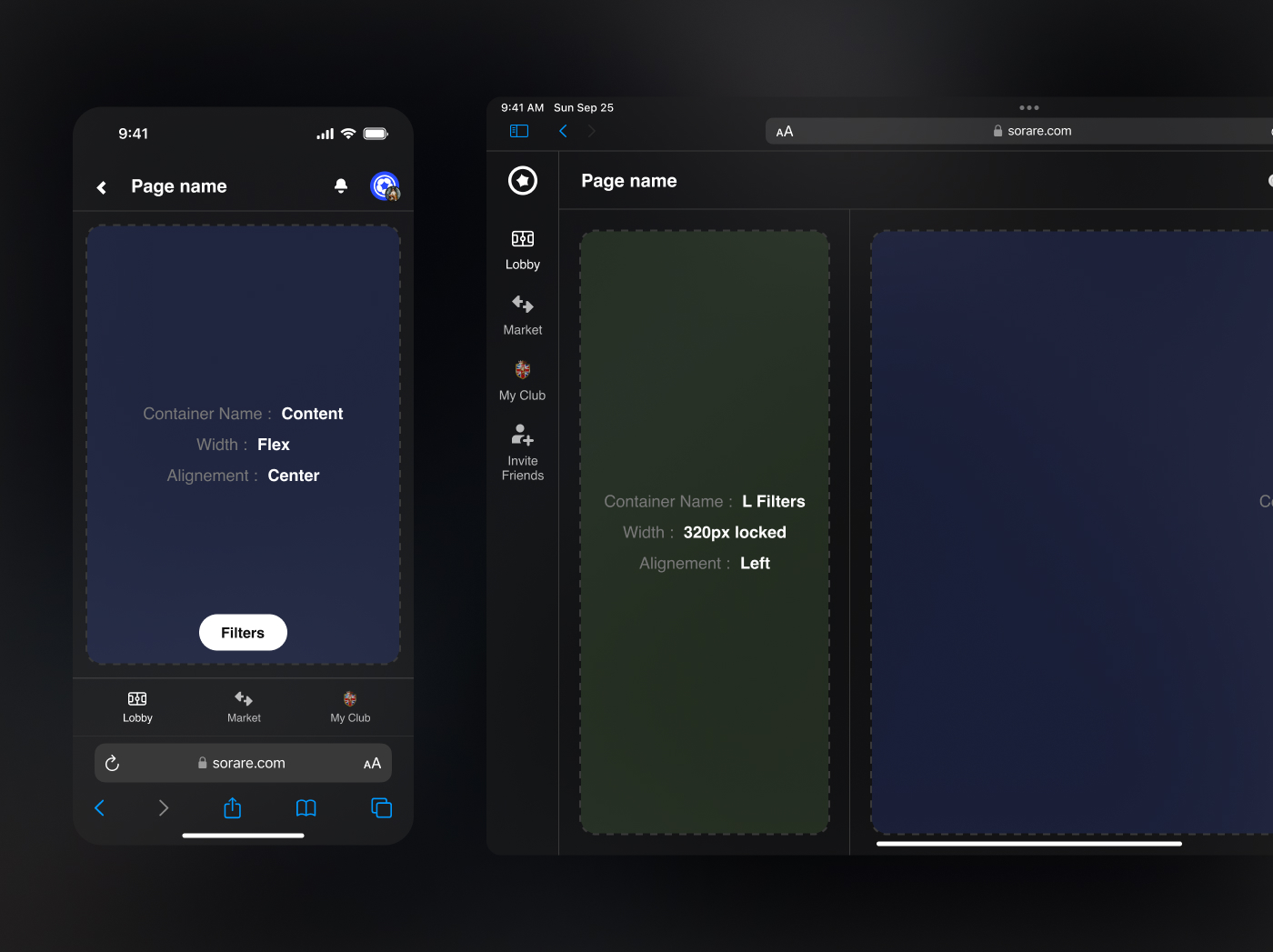
Navigation
It also includes navigation elements for all platforms: Android, iOS, and Desktop.
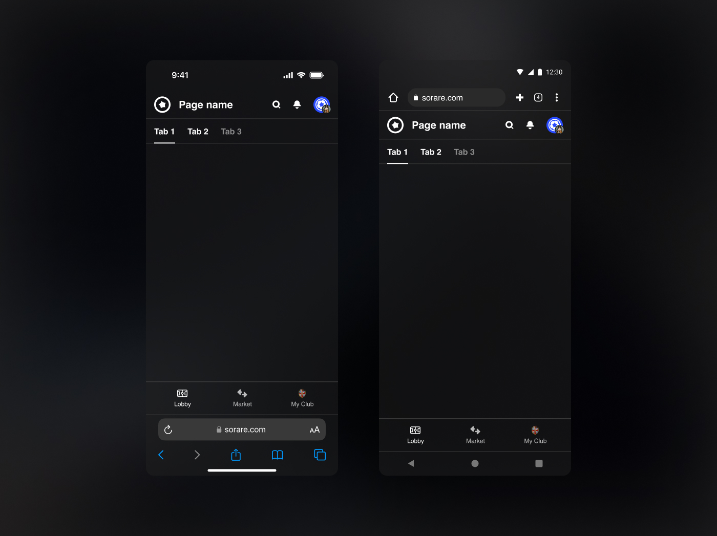
iOs / Android navigation
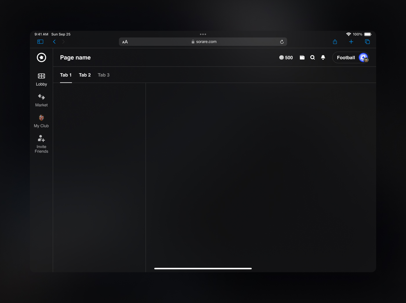
Desktop navigation
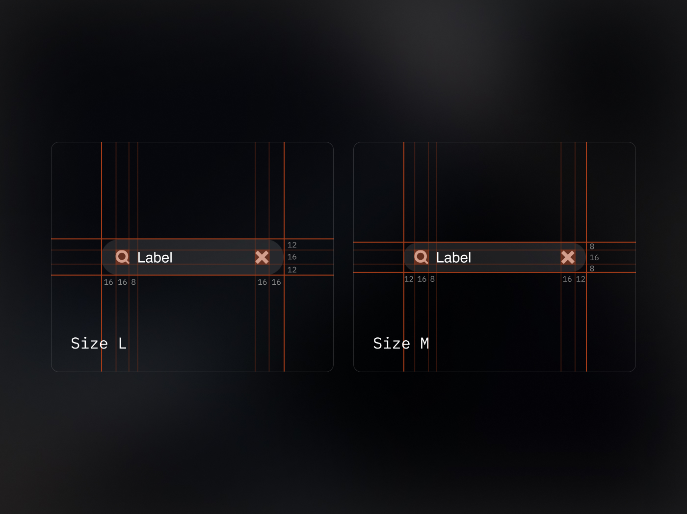
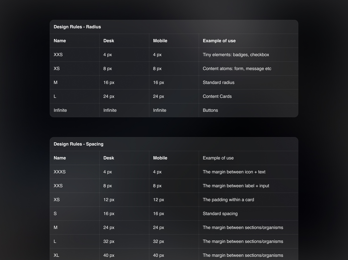
Spacing & radius
Thanks to local variables, it also includes rules for spacing and border radius.
Styleguide
The styleguide file serves as a practical guide to explain how the entire design system works. It also includes all the basic layouts, providing a clear reference for the consistent application of the design system.